Hey
My name is Brandon Daley and I am a sophomore majoring in Supply Chain and minoring in Statistics. As a kid, I would always love to memorize the lyrics and melodies of some of my favorite artists. Today, I wish to apply that same passion to the music industry as part of a record label.
In one of my classes, the Business of Music, we’ve recently uncovered some corruptions going on inside the industry. Artists are not getting paid the royalties they’ve earned, samples of songs are being borrowed without the songwriter’s consent, and controversy surrounds Beyoncé’s regarding the means of having twins (did she use invitro)? These are all major claims against an institution I believed to be above it all. So, could they really be true? Curious, I decided to investigate one of my own.
After sifting through many Excel files, I found a claim that fit my angle, outlining last year’s Grammy nominated albums: Are major retailers stealing money from some of our favorite artists? I decided to approach this very provincially, through the use of two distinct variables. One was the Manufacturer’s Retail Selling Price (MRSP), which was the price they predicted the album would go for. The other was Retail Selling Price, or the price major retail outlets (like Walmart or Target) set after receiving the albums in store. If there was a significant difference between the two, then the artist was getting cheated out of the money they deserved.
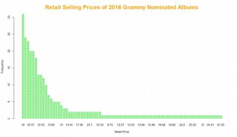
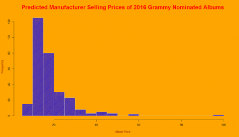
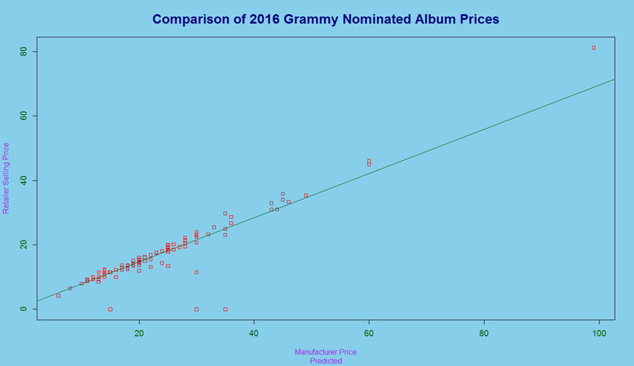
To begin, I wanted to gauge the distribution of both my variables. Since my sample size was large, per CLT (the Central Limit Theorem, 295 albums in the set), I knew the data would be very accurately depicted, and that a bar plot and histogram would present clear, concise graphs. With so much data though, it was essential not to squish the display and add excess breaks (I added 25 in my case). For both visuals, the album prices, I discovered, were skewed right, meaning most the data was concentrated on the left. This meant that both the manufacturer and the retailer were similarly matched and sufficient in proving our point. The best way, however, to confirm this belief was to pair both variables side by side. By placing MRSP on the x-axis and Retailer Selling Price on the y, it became easier to eyeball the alignment of the data by using a scatter plot. With the help of a regression line, anything above or below could subsequently be labeled an outlier. Ultimately, artists, at least in this sense, were fairly compensated for their work.
I learned a thing or two from this assignment. First, statistics intend to deceive. Even though our hypothesis rang true this time, it may not be clear cut the next. Who’s to say there’s isn’t a price difference for next year’s albums, or the albums of underrepresented artists? These are things statisticians must keep in mind. The other is that data is sometimes messy, but with a little imagination (and proper coding), you can do anything you want with your set. In the future, I hope to build to the complexity of my graphs and find more obscure trends to make my own data puzzles.
Happy hunting! If you wish to access my data, feel free to access the link below. Thanks!
Data Source:
http://webcache.googleusercontent.com/search?q=cache:IFEOpSjX3cYJ:www.ba...